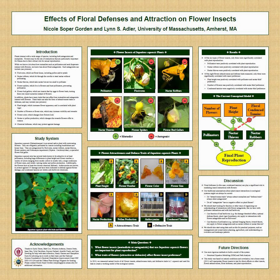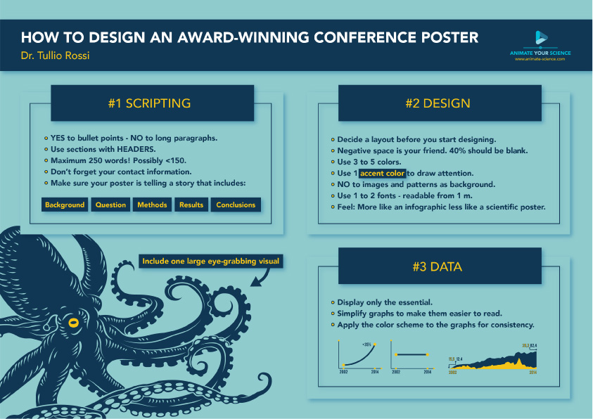
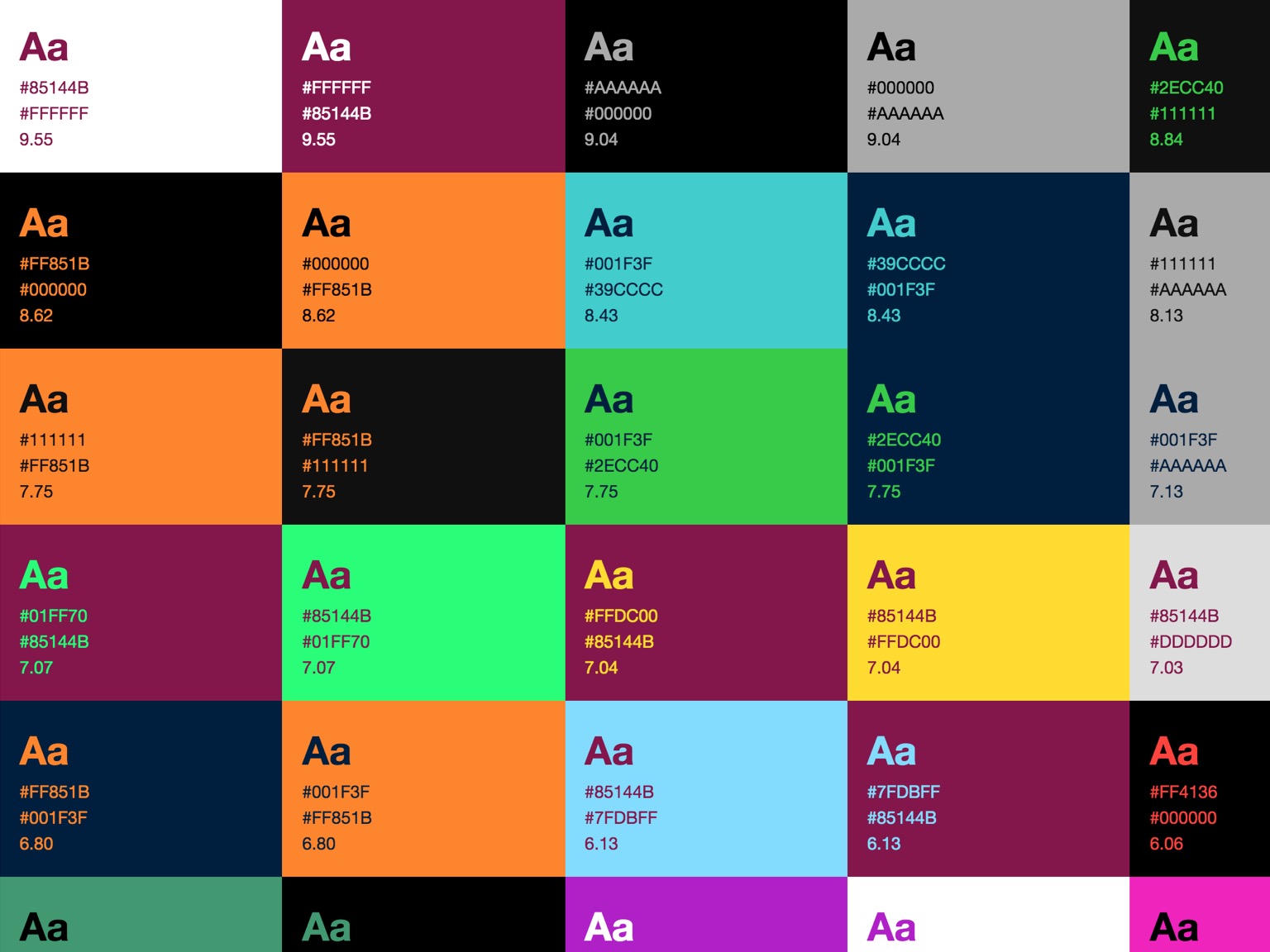
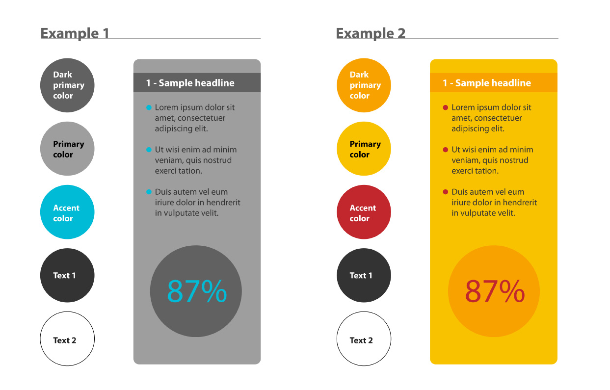
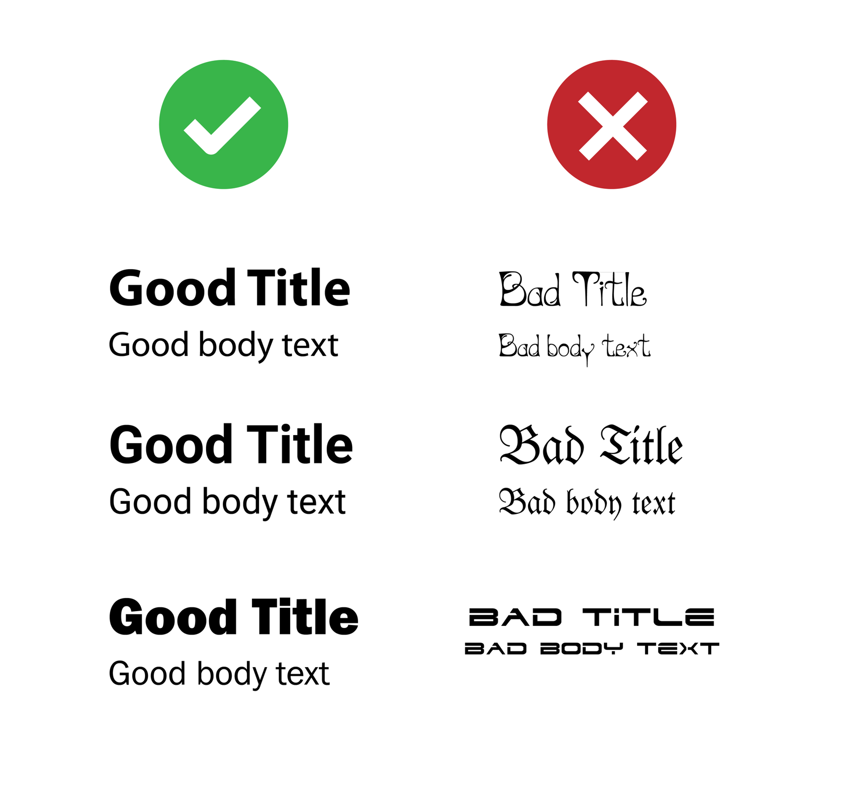
Maintain a color scheme
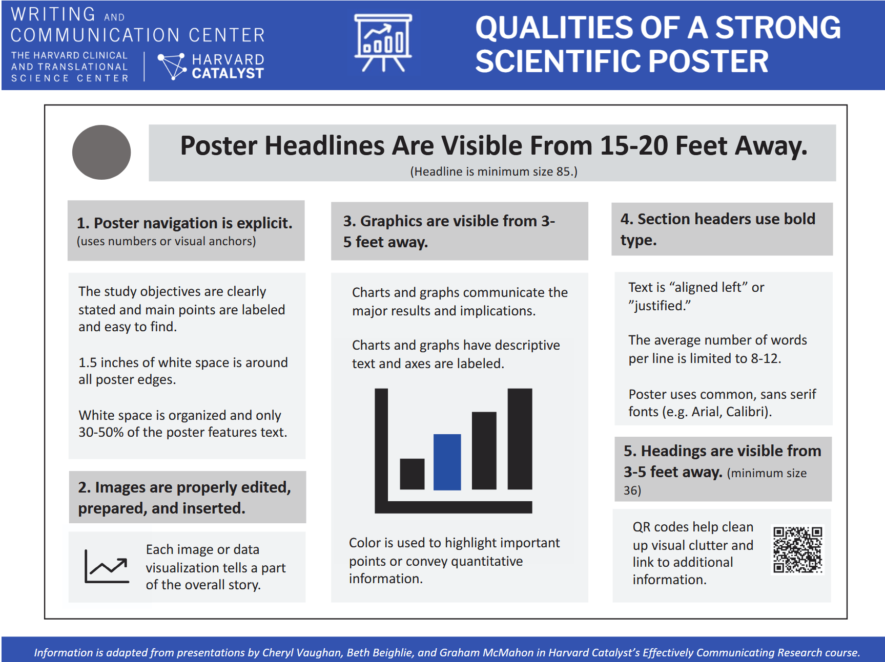
A few quick tips for making a research poster

ARNA, INSERM U1212, CNRS UMR 5320, Université de Bordeaux
UFR des Sciences Pharmaceutiques, Université de Bordeaux
February 11, 2026
Less is more!
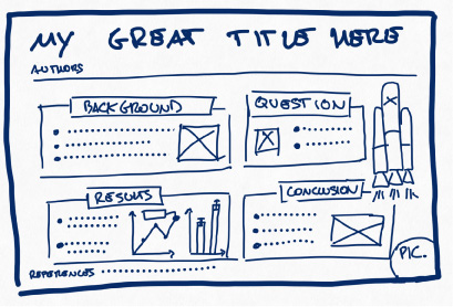
Your poster should be
Warning
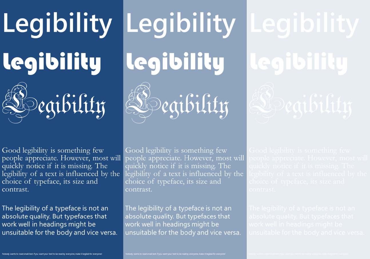
Think visually. Important things go first: capture then guide attention.
Tip
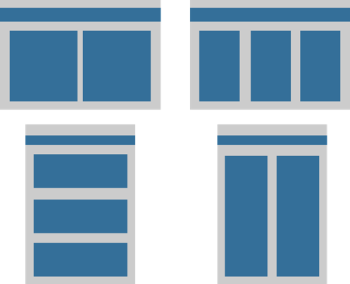
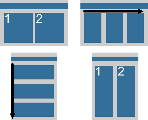
A columnar format helps traffic flow in a crowded poster session.
Warning
Avoid fighting reader gravity, pulling the eyes from top to bottom and left to right
Tip
Print your poster in A3 or A4 size to check that text is legible